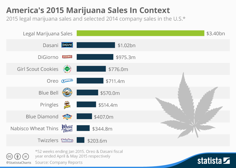
Mar 30, 2016
Okay, so this one is not music related, but thought that just maybe it would be of interest to our readers.The green revolution is big. How big? Let's say Oreos-times-five big.Check out this chart from Statista.Need I remind you that Twizzlers are legal in all 50 states, where marijuana has only been available...
Jul 16, 2015
I love Neil Young, but he really made a mess of things yesterday by taking to Facebook to complain about, of all things, streaming music. "Old Man", indeed. This is coming from the guy who recorded an album in a early 20th century phone booth.I don't deny artists the ability to take a...
May 19, 2015
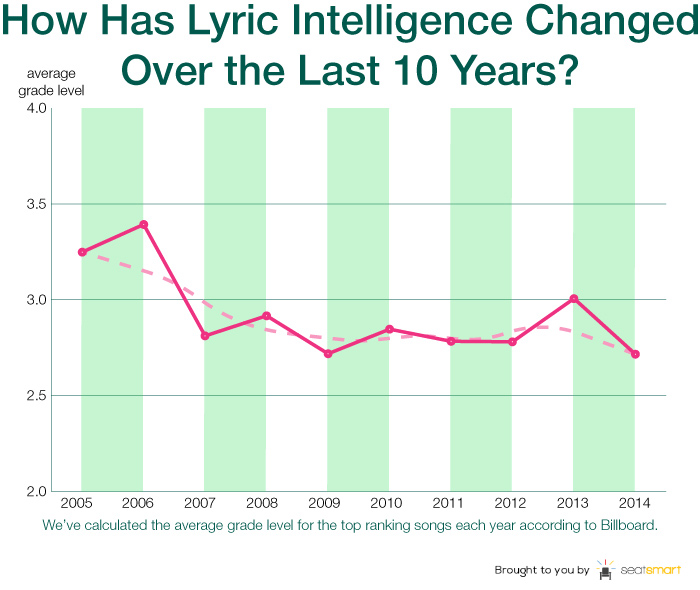
Though nobody considers hit radio singles to be the most intelligent form of music, a recent study by Andrew Powell-Morse aims to show exactly how dumbed down the last decades chart-toppers can be.Powell-Morse formulaically analyzed the reading levels for 225 songs that spent at least three weeks atop Billboards Pop, Country, Rock and Hip-Hop song...
Oct 28, 2014
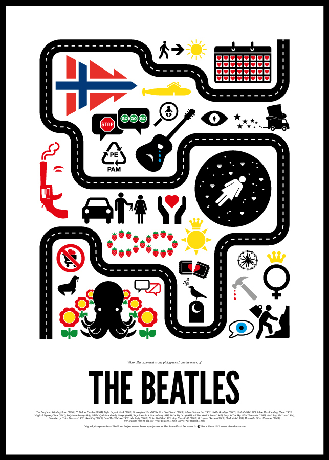
We've been big fans of the work of Swedish graphic designer Viktor Hertz for a few years now. His series of song pictograms for Bob Dylan, The Beatles, David Bowie and more have long been some of our most perennially beloved content shared over here.As a freelance designer, he's using some of that creativity...
Jan 10, 2014
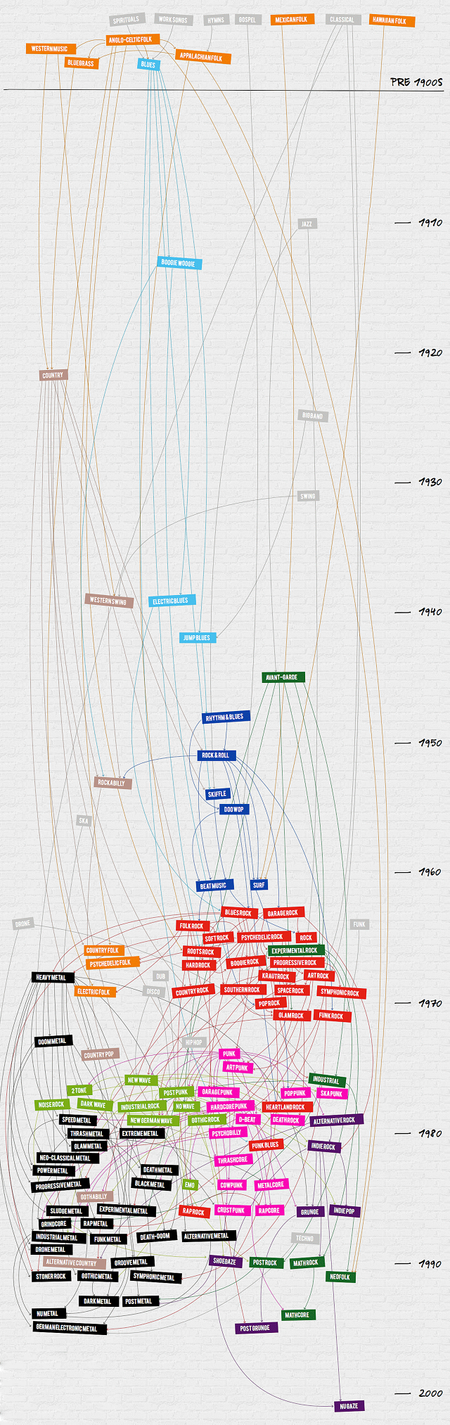
The creator of this Infographic contacted me with the question: did we get it right?Well, not sure if anybody could adequately fact check this winding visual amalgam of genres related to Rock and Roll over a 100 year timeline, but it is sure fun to click around in. Click through and the first thing you'll...

Nov 20, 2013
Spend enough time a concerts and this comic / chart from Virus Comix starts to look awfully familiar. Hopefully Phish fans can appreciate #12. But we're all #16 here, right?
Oct 3, 2013
I went all in for Spotify once it hit the U.S. and it's been nothing short of a dream come true. At this point, it'll be hard to pull me away, even though Thom Yorke calls the music industry's relationship to itthe last desperate fart of a dying corpse. I literally use it every...
Mar 20, 2013
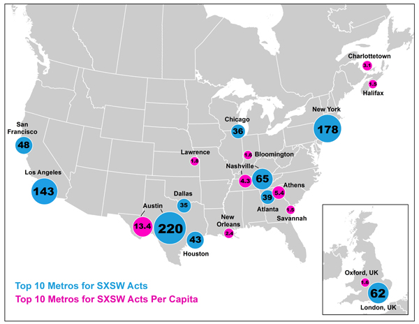
This was an interesting little visualization, courtesy of The Atlantic, which notes the top ten metro areas, ranked by number of bands originating from there who performed in officially listed showcases at the 2013 South By Southwest conference. Chicago just edges into the top 10 with 36 bands.The second set of plots is equally as interesting. Marked...
Oct 24, 2012
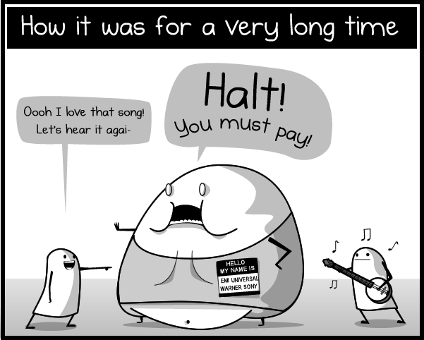
Webcomic The Oatmeal is extremely popular. So much so that Matthew Inman, its creator, was able to motivate tens of thousands of donations to charity (including the building of a goddamn Tesla museumte...not the Tesla you're thinking of music fans) entirely via mentioning it on his blog. So, while the site probably doesn't need...
Oct 17, 2012
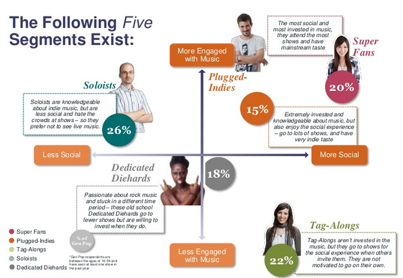
If you ever thought for a second that the relentless consumer profiling practiced by our corporate overlords didn't apply to concert goers or music fans, think again. In their study Anantomy of a Live Music Fan: The Social Effect, BandsInTown offers a consumer segmentation analyis that is as robust as any you'd find in just...