Here at The Barn, my passion for charts, graphs and infographics of all sorts has led me to rethink about how we music fans consume concert setlists. Like many of you, I've always had a passion for song lists and have dog-eared, worn and annotated Deadbases to prove it.
 But, I've also thought there was a way to improve the traditional setlist, to get more information visually from its presentation. Hence, I have invented the VISUAL SETLIST (patent pending), a sort of hybrid of an infographic and a setlist.
Inspired by the concept of the Word Cloud, I thought it might be interesting to use the presentation of the setlist itself (as opposed to accompanying footnotes), to provide contextual information about the song performed via font sizes, colors and other attributes. The idea is to communicate more information about the performance at-a-glance than simply the songs played and transition information.
For example, song titles that appear larger and darker are rarely performed; smaller and fainter are in heavy rotation. Tour debuts are underlined and really special songs (first time played or played after long gaps) are marked with bolder and different colors. An accompanying bar graph also provides some insight into song lengths and the overall flow of the show.
There are more innovations in the hopper -- which will hopefully include a way for other bloggers to easily incorporate Visual Setlists into their own sites. Stay tuned or drop me a line at info @ tomorrowsverse.com for more details or suggestions.
So without further adieu, let me introduce an example and give some clues about how to interpret:
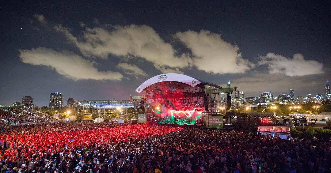
2011-07-03
Watkins Glen International Watkins Glen, NY
One: Soul Shakedown Party, AC/DC Bag > The Curtain > Colonel Forbin's Ascent > Fly Famous Mockingbird, Destiny Unbound > Big Black Furry Creature from Mars > Wilson > Mound, A Song I Heard the Ocean Sing, Time Loves a Hero, Reba > David Bowie
Two: Big Balls > Down with Disease > No Quarter > Party Time > Ghost, Gotta Jibboo, Light, Waves > What's the Use?, Meatstick > Stealing Time From the Faulty Plan, Star Spangled Banner
Encore: First Tube
![]()
Phish Visual Setlists use the 3.0 era as a reference point. Songs listed in the smallest font have been played greater than 40 times since 3/6/09, with font sizes getting progressively larger between with performance in the range of 21-40, 7-20, and 4-6. Songs played 3 times or less will be presented in the largest font size.
The color of the song listed corresponds to the gap since the last time the song was played. The faintest colors represent songs played last 1-2 shows ago, getting progressively darker for gaps of 3-10, 11-20, and 21-30 shows, with the darkest colors being performed 30+ shows ago.
A tune performed for the first time this tour will have its song title underlined. Debuts will be presented in red; songs returned to the rotation for the first time since the reunion are represented in purple.
Each Visual Setlist is also accompanied by a bar graph. The lines on the graph are analogs to the songs played (first song of the first set is the leftmost bar, last song of the encore is the rightmost bar, with blank spaces for set and encore breaks). The length of the bar represents the length of the song.
Look for Phish visual setlists, as well as visual setlists for many of my other favorite bands, the morning after each performance. For now, have a look at the first batch:
Click here to view Phish Summer Tour 2011 - Leg One and Super Ball IX Visual Setlists