Feb 24, 2011
In the last week, we've shared streams of a Trey show and a Keller show at tomorrowsverse.com, and expect to share more in the future, but we're probably not even a 1000th of a pixel on this heat map which shows the relative size of the places we go online to listen to music...
Feb 21, 2011
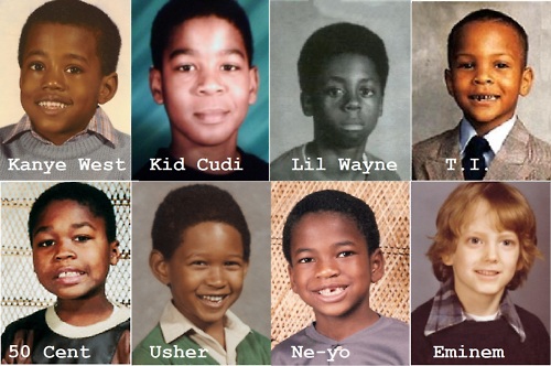
Okay, so hip hop is not our usual beat, but when I saw this over at the I Love Charts tumblog, I felt it was so incredible in so many ways that I just had to share.Who pissed in Lil Wayne's cheerios the morning of school pictures? My guess: Usher.
Feb 12, 2011
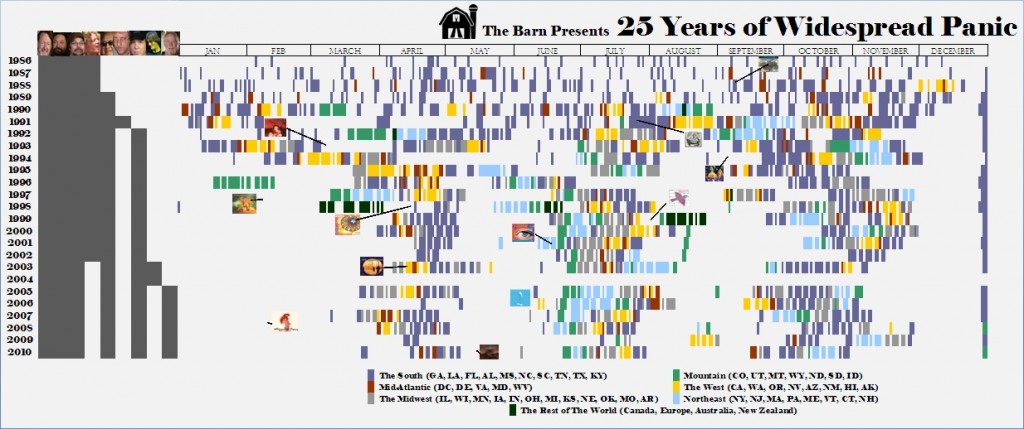
In celebration of the 25th anniversary of Widespread Panic, The Barn has created an InfoGraphic to attempt to put this incredible career and vast creative output into perspective.Working from a 25 year timeline from the band's first show in Athens, GA in February of 1986, this graphic plots the band members, shows, and studio albums (plus...
Jan 27, 2011
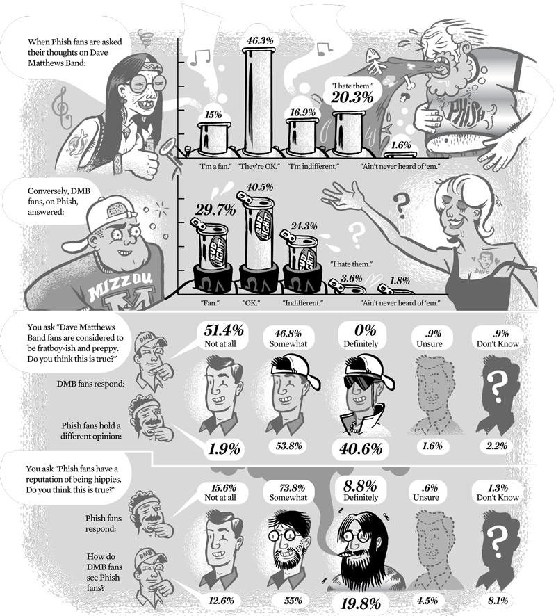
The Internets are all abuzz these days about the potential for multi-day festivals featuring Dave Matthews Band and Phish, swapping out headlining spots that cap off a day-long music lineup. While we know the DMB part of this is absolutely true, there is rampant speculation regarding who else is on-bard, a number of different locations...
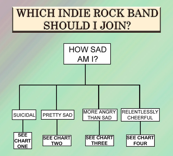
Jan 18, 2011
Don't know why the author of this flow chart (source: Houston Press blogs, John Seaborn Gray) chose to frame it as which band to join, as opposed to "listen to" or "like". I guess its worth it for the sly Arcade Fire reference.Regardless, I may be using this chart to check out a couple...
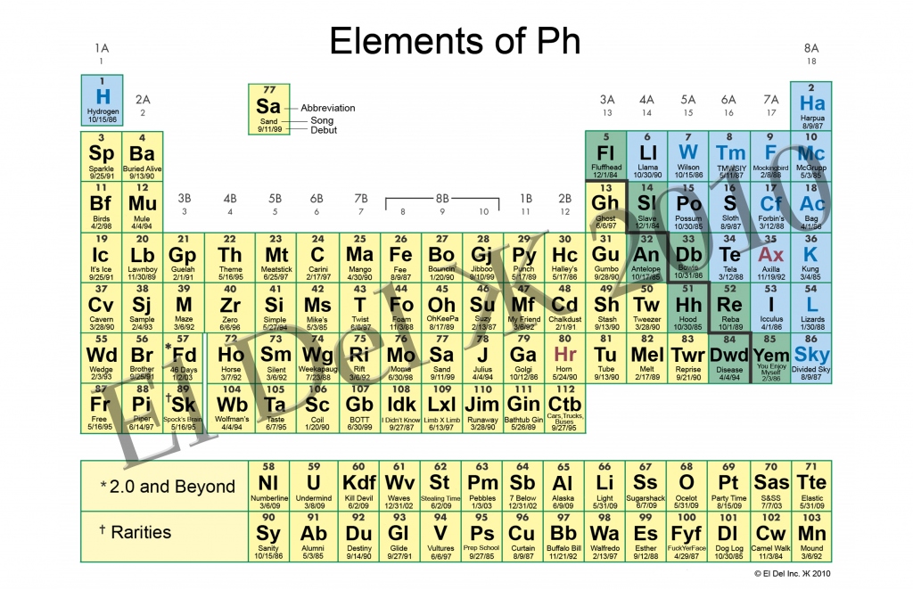
Jan 16, 2011
I've been a fan of the sub-genre of InfoGraphics, the period table of whatever, for a while now. This awesome collection page at Unneccesary Umlaut collects some of the very best. You'll find periodic tables of swearing, beer styles, video game controllers and other trivalities... No music though, which is why my jaw nearly dropped...
Jan 11, 2011
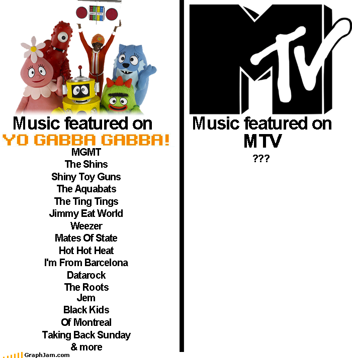
Bringing together our recent Talking Heads video retrospective with some of the characteristics of our suburban (with kids) readership, its time we drag out the old "whatever happened to music on MTV" cliche. Done right, in Infographic form, this clever chart plucked from graphjam.com, features this month's Relix cover boy DJ Lance Rock, the...
Jan 5, 2011
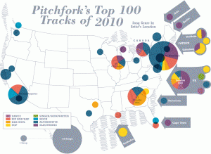
Seems like we can't get enough of Pitchfork this week...With year end "top" lists emerging, Pitchfork and Billboard offer a treasure trove of data for analysis and innovative presentation this year. The visual geniuses at verysmallarray.com have managed to overlay the total number songs, by genre and location, on each list for a...
Jan 1, 2011
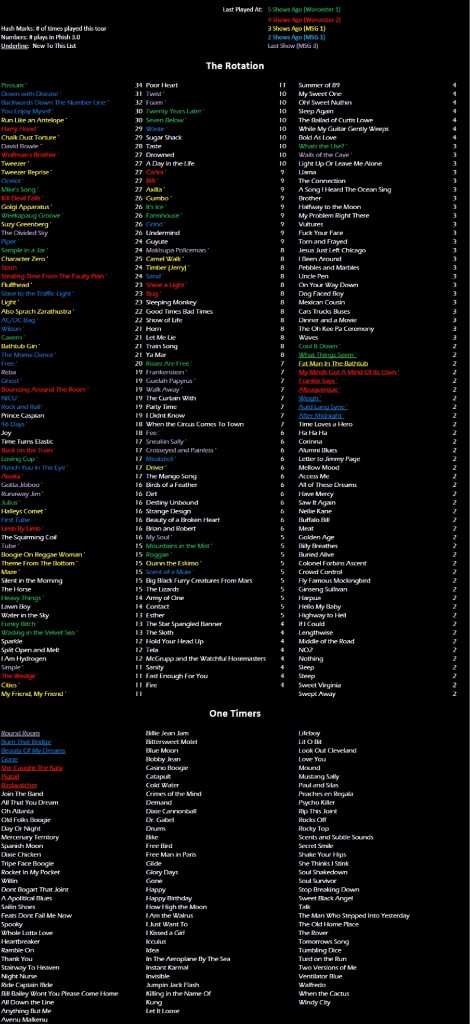
Now updated with MSG3 Data!A visual way of viewing Phish's last few shows within the context of their overall rotation and a cool way to guess what is coming next.Click to view full size.Here's how the rotation looked before the 1/1/11 show.
Jan 1, 2011
Even casual readers our site may notice the affection and attention we lavish on bands that dabble in improvisational rock. We do this because we unabashedly love these bands, though not at the expense of all other music. It seems, however, that fans of jambands can't get a break when it comes to respectability amongst...