Oct 17, 2012
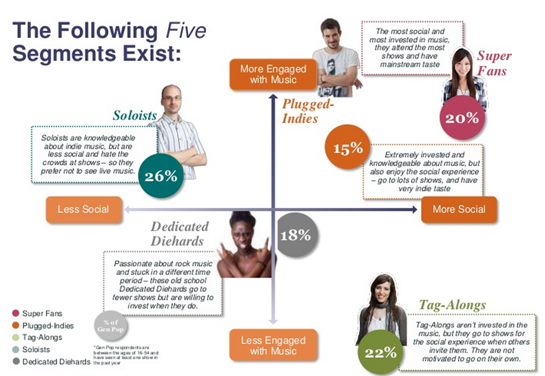
If you ever thought for a second that the relentless consumer profiling practiced by our corporate overlords didn't apply to concert goers or music fans, think again. In their study Anantomy of a Live Music Fan: The Social Effect, BandsInTown offers a consumer segmentation analyis that is as robust as any you'd find in just...
Sep 20, 2012
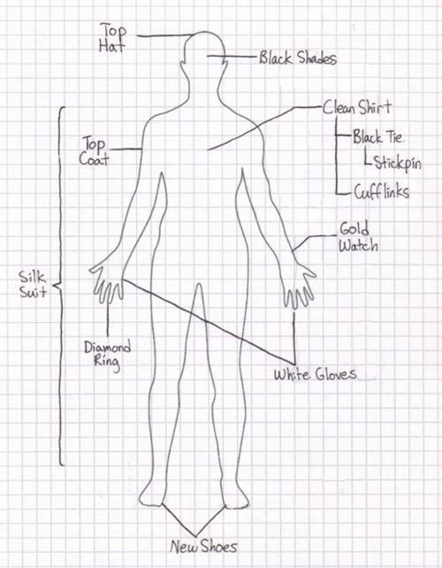
I'm glad the author of this chart (rockcharts.tumblr.com), used graph paper for precise measurement of how exactly to dress sharp.
Aug 22, 2012
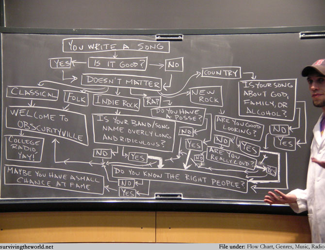
Surviving The World offers lots of irreverent graphs and flow charts, doodled on chalkboards to add a whiff of academic certainty to them. Here's a music related flow that deals with one of my minor obsessions... figuring out how some artists break through and have radio hits. As you can see, it's all about who...
Aug 15, 2012
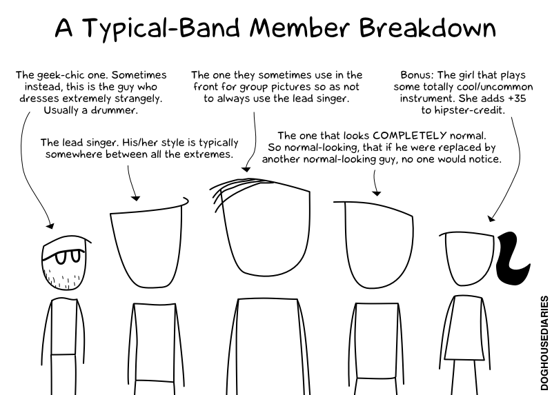
File this one under just for fun, but it'd be interesting to see how many band photos you can find that follow this same pattern. It certainly seems like it is an accurate description of most of the promo photos that get circulated around the net. Thanks to online comic doughousediaries.com for putting this...
Jul 16, 2012
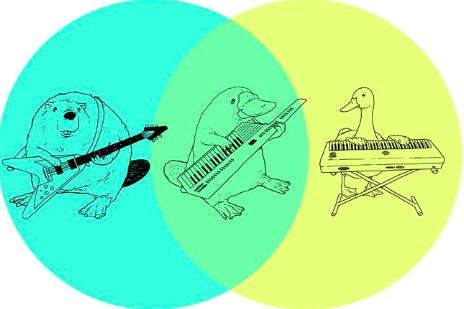
This one works on so many levels, it is no wonder it is a favorite of the curators of ilovecharts. I dedicate its inclusion on tomorrowsverse.com to my favorite keytar player, The Chairman Of The Boards Page McConnell.
Jul 12, 2012
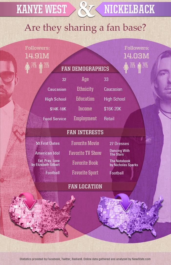
One is a critically acclaimed, though public relations challenged (misunderstood?), and innovative hip-hop artist. One straddles the line between huge commercial success and equally charged public hatred for their formula-driven hard rock.Oddly, as newstats.com attempted to prove, fans of Nickelback and Kanye West aren't all that different. Upon deeper consideration, when artists cast...
Jul 10, 2012
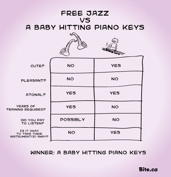
That smooth atonal sound. Volatile swells of seemingly random notes without plan or reason. Moments of sweet silence followed by violent aggression. Sometimes you have to wonder: am I listening to free jazz or could this be something else? Here's a handy chart (from bite.ca) to help you out in these circumstances.
Jun 21, 2012
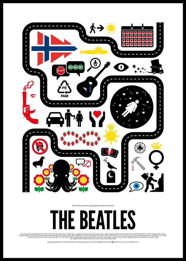
While the infographics I often feature on this site intend to make data easier to consume by employing clever visuals, this set of graphics proves that it's equally fun to use visuals to obscure meaning.Designer Victor Hertz has created some rock music pictograms that do just that for the songs of David Bowie, Bob...
Jun 21, 2012
Whosampled.com is an interesting new site that claims to "explore the DNA of modern music". The makers have assembled a massive database of sampled music -- allowing users to explore where songs have been used, by whom and where -- as a means to create a rich web of music exploration.What to know...
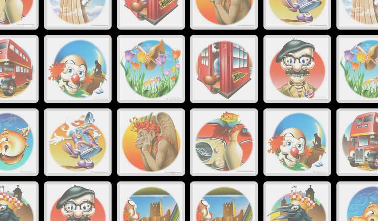
Jun 1, 2012
If you're a Deadhead, there's a slight chance you may experience short term memory loss from time to time. Why not work out that brain by attempting the time-tested challenge where Memory is literally the name of the game?And there's no reason to settle for just any Memory game. Dead.net is offering this...