Mar 20, 2013
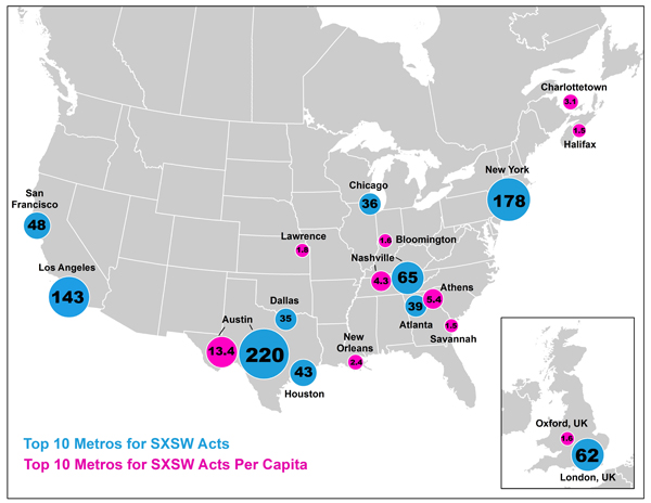
This was an interesting little visualization, courtesy of The Atlantic, which notes the top ten metro areas, ranked by number of bands originating from there who performed in officially listed showcases at the 2013 South By Southwest conference. Chicago just edges into the top 10 with 36 bands.The second set of plots is equally as interesting. Marked...
Mar 20, 2013
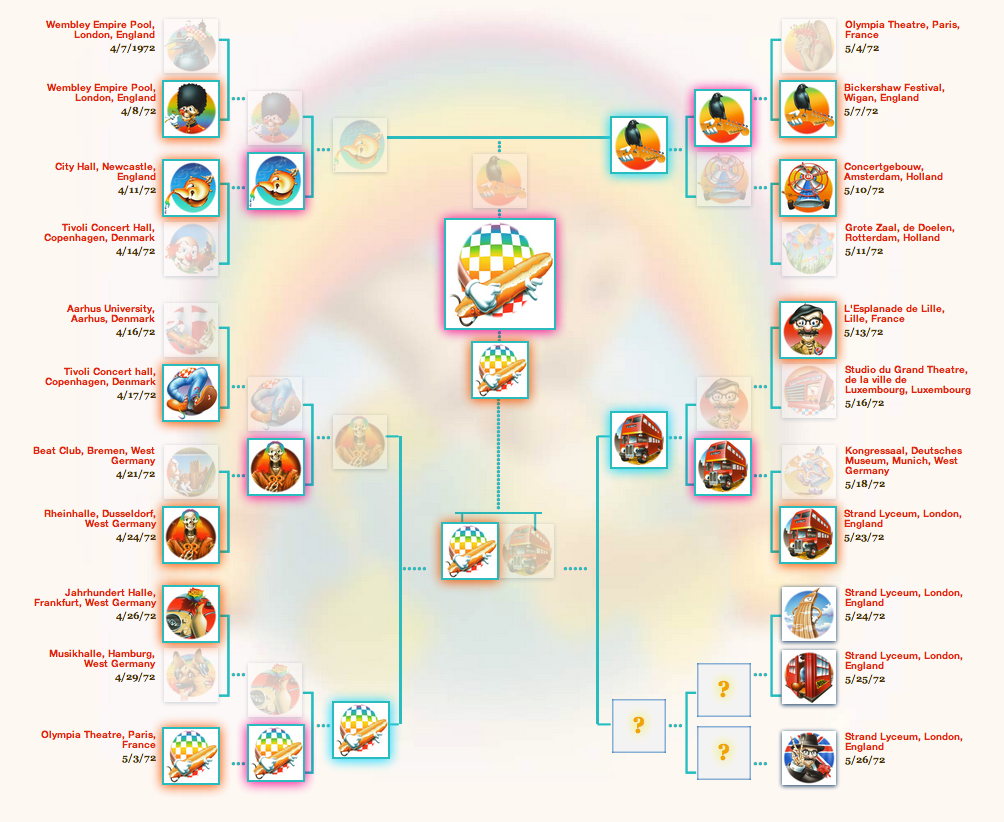
With the NCAA tournament starting up again, the blogosphere has been lit up with brackets of all sorts and our corner of the music world is not immune. I was intrigued with the drama and thrilling upsets last year's tournaments, but there's even more this March. Here's five jamband brackets, some thoughts on how last...
Mar 14, 2013
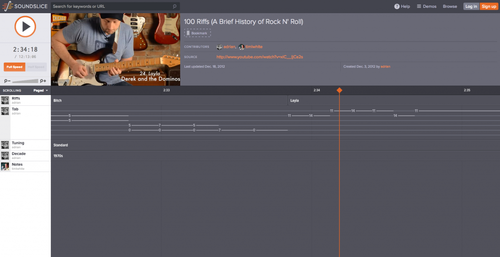
This is just so cool in so many ways. Let's start at the beginning and work our way to the end...1. Somebody identified what he considers to be the 100 most essential riffs of all time -- spanning seven decades of rock history2. This person can play every single one in a convincing manner3. He has...

Jan 31, 2013
To celebrate 55 years of Lego, the company created fifty-five posters depicting popular culture vis a vis the reliable, interlocking toy brick. The complete list includes movies, stories and other elements, but I wanted to single out the nineteen music related ones here. They cover the gamut from bands to albums to songs, mostly playing on...
Jan 29, 2013
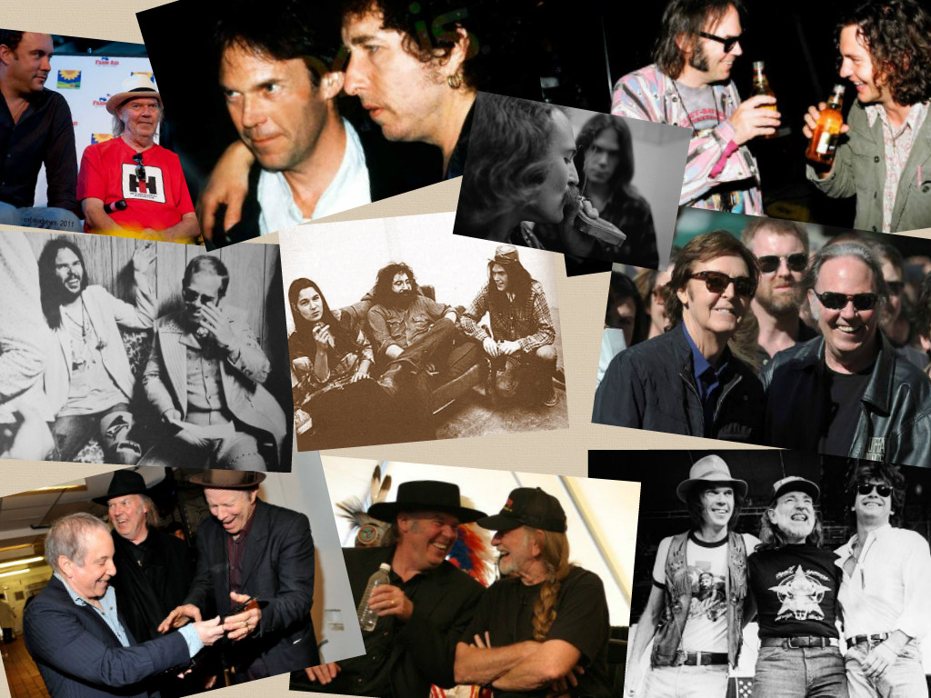
I recently finished Neil Young's autobiography Waging Heavy Peace -- and while I'll save all my thoughts on that tome for another post, one of the things that did stand out was how much he values the friendships in his life, whether they be musical, business or otherwise. At around the same time, I came...
Jan 16, 2013
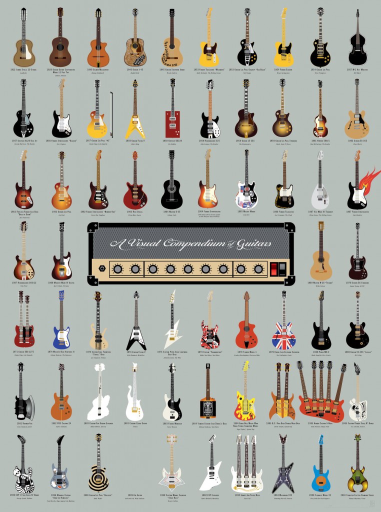
Pop Chart Lab makes some of the coolest looking charts / prints / posters that I've seen. Their design philosophy employs a simple, clean aesthetic. I'm particularly happy to see their music-related efforts pop up every now and then. Though this print doesn't feature an Irwin or Languedoc, there are pleny of iconic guitars (...
Nov 29, 2012
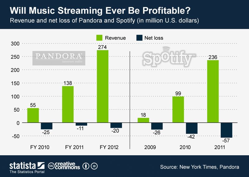
One of the most fascinating things to observe as a huge music fan and somewhat "technology forward" individual is the shifting landscape of music consumption. The vast physical musical collections that used to line my shelves were eventually digitized and stored locally, until finally much of the music I consume comes from the cloud.This...
Nov 13, 2012
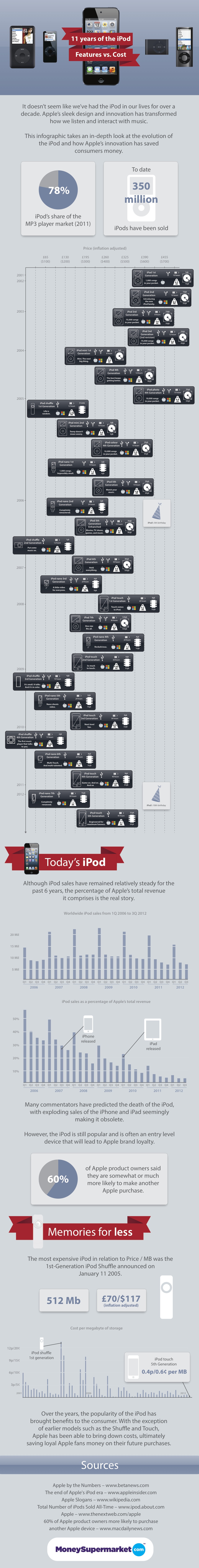
I usually not a big fan of these types of "giant" infographics, usually created by shady Internet companies to generate link bait, but this one is actually informative and pretty well laid out. It brings me back to my very first iPod (3rd generation, 10GB... which I pronounced the greatest invention in the history of...
Nov 1, 2012
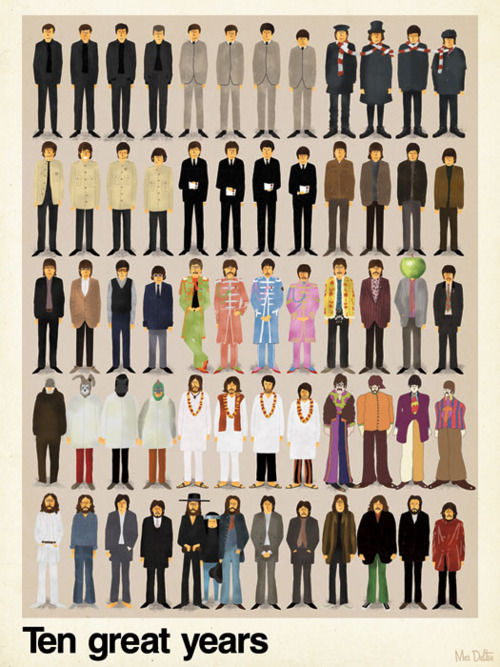
Ten years, 49 figures, 12 iconic looks, 6 people. This poster, found at Audry Wiener Dog Tumblr, oozes worlds of musical output while focusing only on their visual style. Love the clever touches like Pete Best in the first pose and Yoko squeezed into the penultimate one.
Oct 24, 2012
Webcomic The Oatmeal is extremely popular. So much so that Matthew Inman, its creator, was able to motivate tens of thousands of donations to charity (including the building of a goddamn Tesla museumte...not the Tesla you're thinking of music fans) entirely via mentioning it on his blog. So, while the site probably doesn't need...