Feb 12, 2011
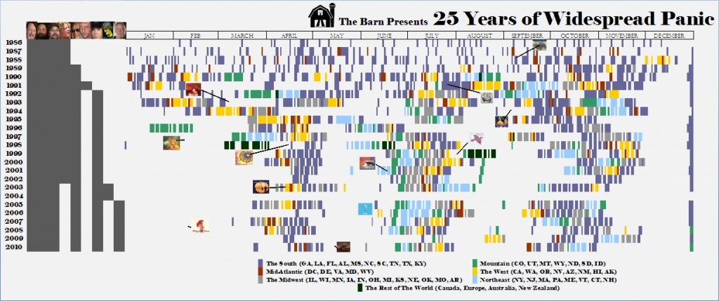
In celebration of the 25th anniversary of Widespread Panic, The Barn has created an InfoGraphic to attempt to put this incredible career and vast creative output into perspective.Working from a 25 year timeline from the band's first show in Athens, GA in February of 1986, this graphic plots the band members, shows, and studio albums (plus...
Feb 8, 2011
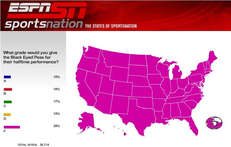
We've got a lot of great stuff to share from this past weekend and some great material to preview for next weekend. But, before we get to that, did you know there was also a football game on Sunday night? And while the teams headed to the locker room at halftime to recuperate and game...
Jan 27, 2011
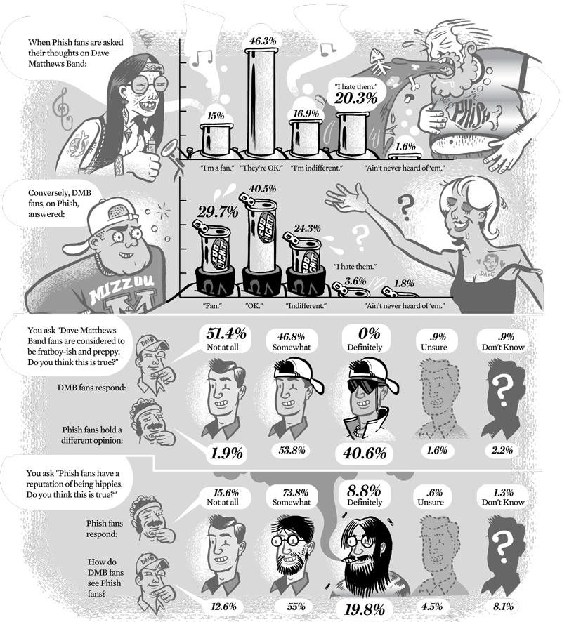
The Internets are all abuzz these days about the potential for multi-day festivals featuring Dave Matthews Band and Phish, swapping out headlining spots that cap off a day-long music lineup. While we know the DMB part of this is absolutely true, there is rampant speculation regarding who else is on-bard, a number of different locations...
Jan 18, 2011
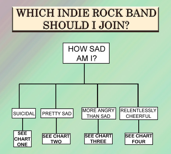
Don't know why the author of this flow chart (source: Houston Press blogs, John Seaborn Gray) chose to frame it as which band to join, as opposed to "listen to" or "like". I guess its worth it for the sly Arcade Fire reference.Regardless, I may be using this chart to check out a couple...
Jan 16, 2011
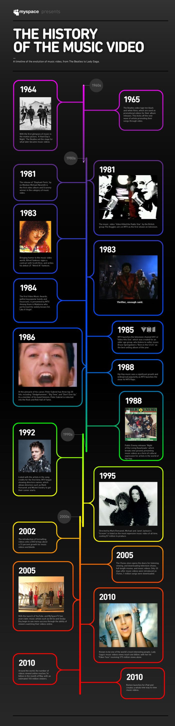
We had so much fun with our Talking Heads video feature and the Yo Gabba Gabba vs. MTV chart, we'll stick with videos at least one more time.This time, the clinging for relevancy folks at myspace offer a classic vertical timeline of the music video, from 1964 to the present. Beatles? Check. Michael Jackson? Check. "...
Jan 16, 2011
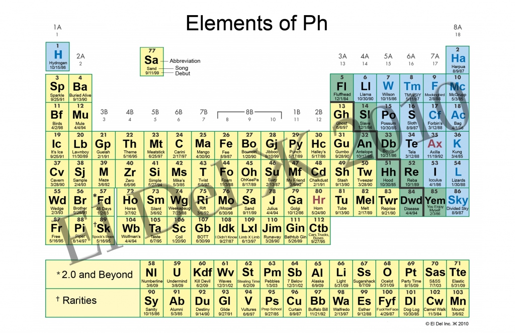
I've been a fan of the sub-genre of InfoGraphics, the period table of whatever, for a while now. This awesome collection page at Unneccesary Umlaut collects some of the very best. You'll find periodic tables of swearing, beer styles, video game controllers and other trivalities... No music though, which is why my jaw nearly dropped...
Jan 11, 2011
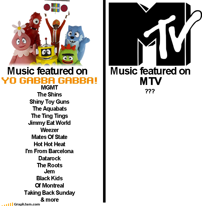
Bringing together our recent Talking Heads video retrospective with some of the characteristics of our suburban (with kids) readership, its time we drag out the old "whatever happened to music on MTV" cliche. Done right, in Infographic form, this clever chart plucked from graphjam.com, features this month's Relix cover boy DJ Lance Rock, the...
Jan 7, 2011
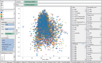
A lot of the music related InfoGraphics we post here are enlightening, though whimsical. Light in tone, they help put some element of music just a bit easier to grasp through drawings, colors, charts and text. Some, however, can be downright academic exercises in complex data analysis and visual thinking. Such is the case with...
Jan 5, 2011
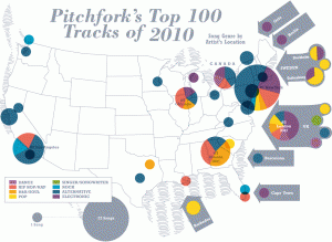
Seems like we can't get enough of Pitchfork this week...With year end "top" lists emerging, Pitchfork and Billboard offer a treasure trove of data for analysis and innovative presentation this year. The visual geniuses at verysmallarray.com have managed to overlay the total number songs, by genre and location, on each list for a...
Jan 4, 2011
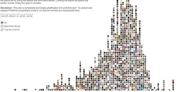
On the heels of The Barn's exclusive chat with Pitchfork's Rob Mitchum, the indie-rock review hub is newsworthy again. This time, thanks to a sweet, interactive InfoGraphic which plots the spectrum of all of the site's 2010 reviews, based on numeric rating. From the snark-drenched panning of Ghostland Observatory's Codename: Rondo (1.5) to a number of 10.0's (...