Oct 22, 2011
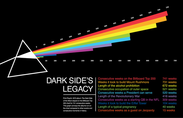
Pink Floyd week continues with another infographic...What does it mean to have staying power? Using the album covers iconic imagery, this infographic from the Behance Network, compares Dark Side Of The Moon's consecutive weeks on the Billboard Top 200 to other notable streaks and series. Zoomed image of the words...
Oct 20, 2011
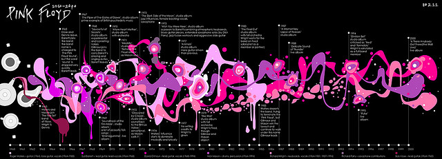
Here's a righteous Pink Floyd infographic, which chronicles significant milestones and band member movement during 40 years of band history. This was crated by a flickr user known as 802.11 and has made tons of appearances all over the web. A great use of some very Floyd-like psychedelic imagery to convey the information. I love it!Click...
Oct 6, 2011
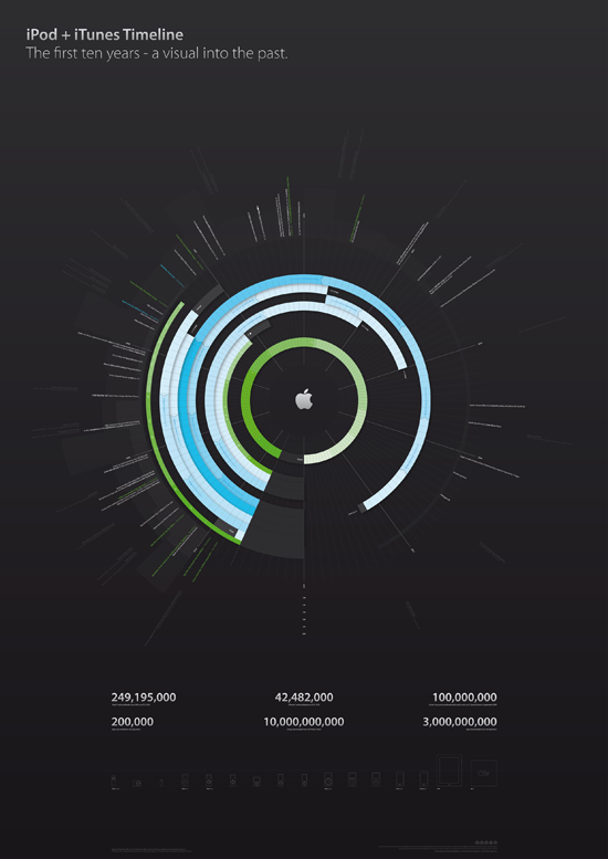
Theres nothing I can say about the vision and leadership of Steve Jobs that hasnt been said more eloquently in eulogies by people that were close to him.I can, however, offer some of the best visualizations on Apples way of revolutionizing the music industry.First, is a radial timeline the first ten years of...
Sep 23, 2011
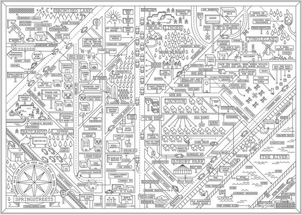
Today is Bruce's birthday. To celebrate, I'm pulling out to interested ways to visualize his work that were found on the web. From the beginning, Springsteen's songs told rich, and involved stories, and many feature places and names. The first addresses the places. Brooklyn based artist Dan Cassaro created a high quality poster that represents...

Sep 20, 2011
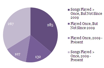
Woe is me. I can't stop thinking of new ways to visualize the information we have about Phish tour. Luckily, the lengthy tour that they completed last week has provided plenty of data from which I could cultivate stupid facts and shape into interesting charts and graphs.First, let me explain the Rotation Graph. In...
Sep 13, 2011
After a blistering four night run in NYC (complete with bonus sets galore for all manner of media outlets), and on the release day of their latest album Death By Stereo, it's not as if fans of Umphrey's McGee need an excuse to get happy.But, when it rains, it pours, and The Barn is...
Sep 3, 2011
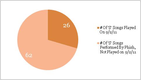
Phish had fun with their setlist last night, reaching deep into their catalog to create two sets filled only with songs that started with the letter "S". Rumor has it that the songlist was offered as a memorial to dedicated Phish fan and Green Crew member Scott Ian Nowak, who passed away last week. Update:...
Aug 30, 2011
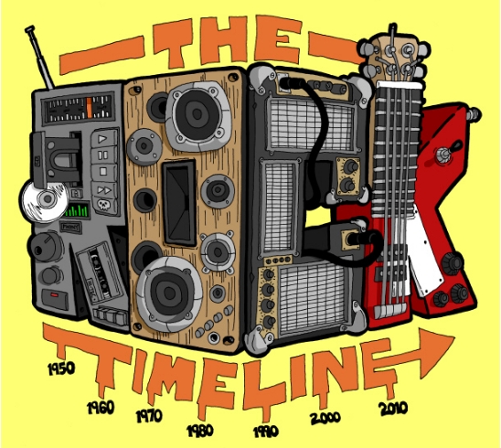
Back in the day, I was always more of a MAD guy than the cruder "knock-off" of Cracked. But, there's no denying that cracked.com owns the new media space, cranking out some decent listicles and some awesome viral content.This rock timeline, created under the Cracked banner by Winston Rowntree at Virus Comix, has...
Aug 23, 2011
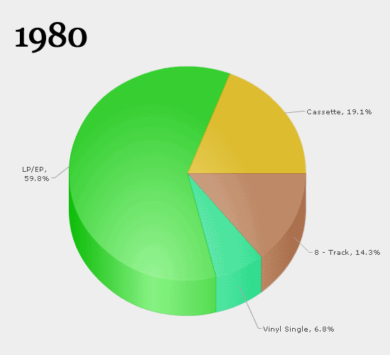
Quick... what was the first album you ever bought? If you've been a music fan for multiple decades, you probably remember it fondly or even with a slight tinge of embarrassment. Now... what format was it? A vinyl LP? A cassingle? 8-track tape? Think of the litany of devices you've had over the years to...
Aug 15, 2011
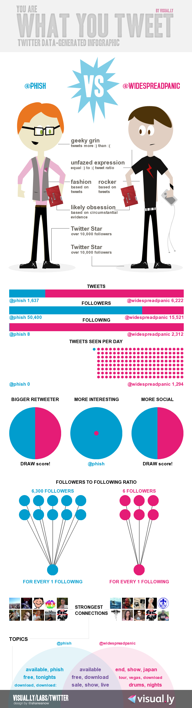
One of our more popular posts ever came in the wake of some rumored (but never materialized) Phish / Dave Matthews Band combo festival dates for the summer of 2011. We re-posted an infographic comparing fan reactions and perceptions about the respective bands and people just couldn't get enough.A perhaps just-as-polarizing comparison is the ongoing Phish...